Custom Blog Design for ADHD users
Fitness
UX/UI
Webdesign

Project Overview
Client: WorkMode, an ADHD-focused productivity startup
Industry: Healthcare & Wellness, Productivity
Timeline: 2 days
My Role: Web Designer
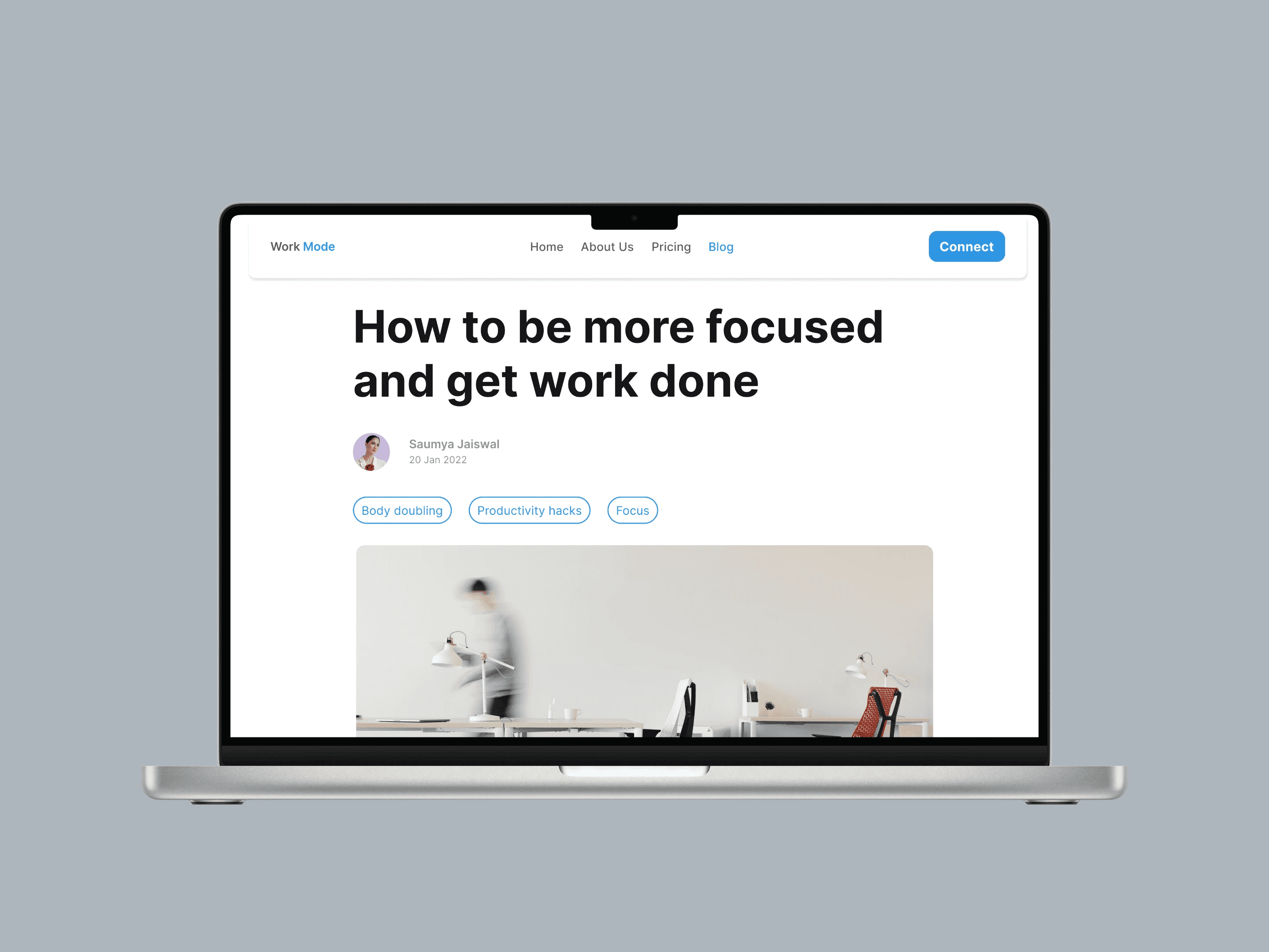
I custom-designed a blog for WorkMode catered to ADHD/ADD users.
📝 TL;DR
As a UI/UX designer, I was hired to create a blog that is easy to use and accessible for people with ADHD and ADD. My goal was to make the blog simple, focused, and free of distractions, ensuring a smooth reading experience.
Project Overview
I was hired to make a custom-designed blog and a smooth reading experience for WorkMode, which primarily catered to users who struggle with ADHD, ADD, and intense procrastination.
The blog had to be clean, simple, and minimal and help users focus on the content.
My process
The project involved designing a blog emphasizing -
1. Simplicity
2. Readability
3. User control.
Below are the key principles I followed to achieve this and their explanations:-
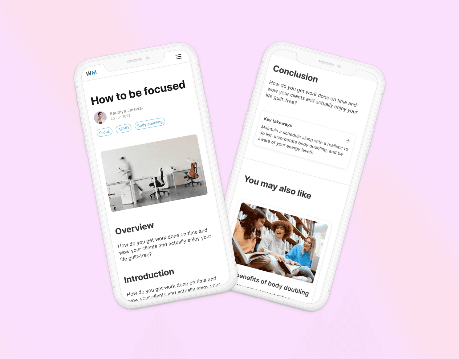
1. Simplify Navigation (Hick’s Law)
Explanation: The more choices a person has, the longer it takes to make a decision.
Application: I designed a simple menu with limited options, making it easy for users to find what they need without getting overwhelmed.
Simple navigation
2. Reduce Clutter (Law of Prägnanz)
Explanation: People prefer to see things in their simplest form.
Application: I kept the layout clean and organized, using white space to separate content, helping users focus on what’s important.
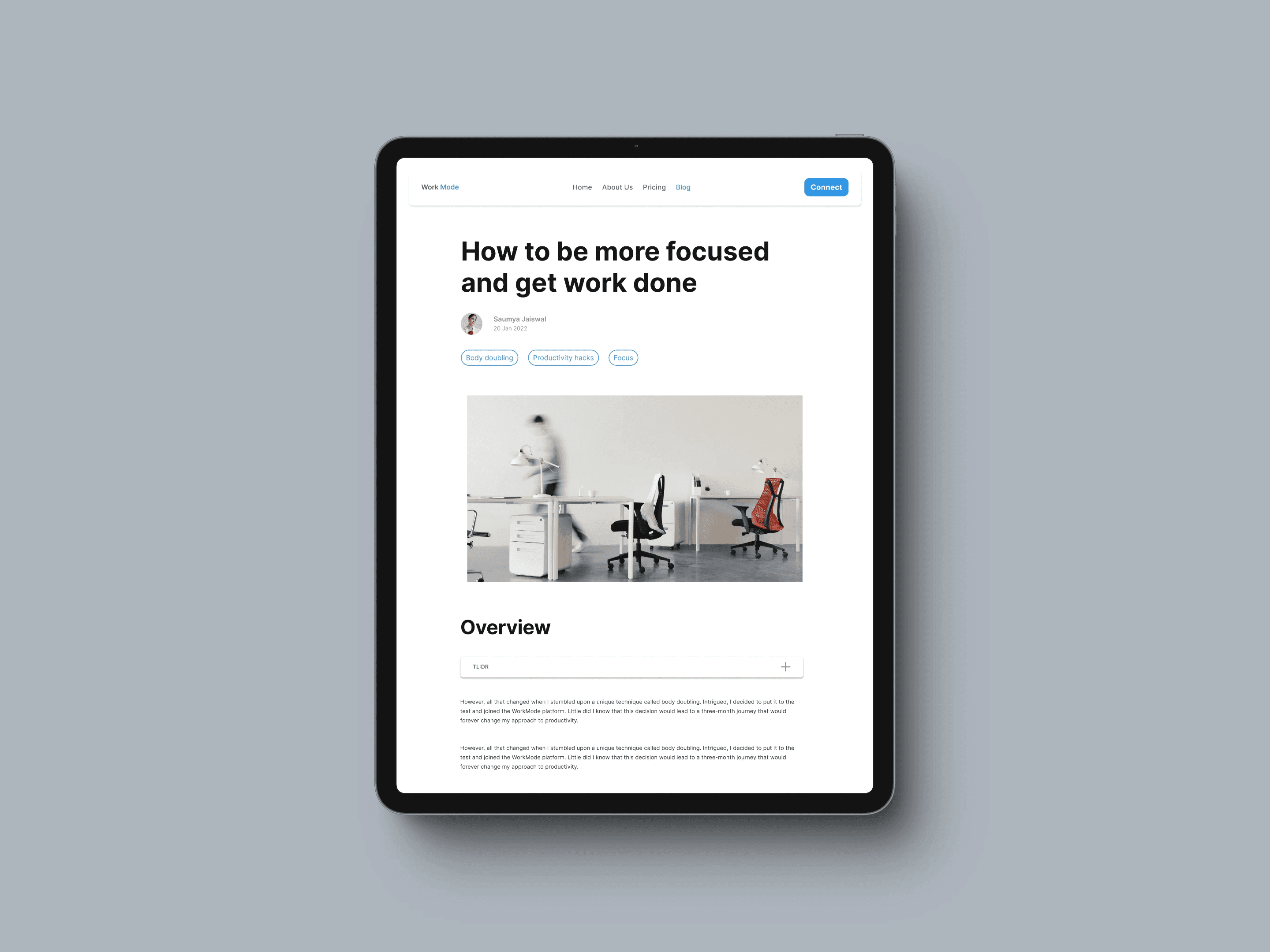
Clutter-free reading experience
3. Limit Distractions (Signal-to-Noise Ratio)
Explanation: Highlight important information while minimizing distractions.
Application: I avoided using flashy animations, auto-playing videos, and pop-ups, keeping the focus on the content.
4. Prioritize Information (Fitts’s Law & Visual Hierarchy)
Explanation: It’s easier to interact with larger or closer elements, and important information should stand out.
Application: I made headlines and key buttons more prominent, using larger fonts and bold text to guide users’ attention.
Visual hierarchy
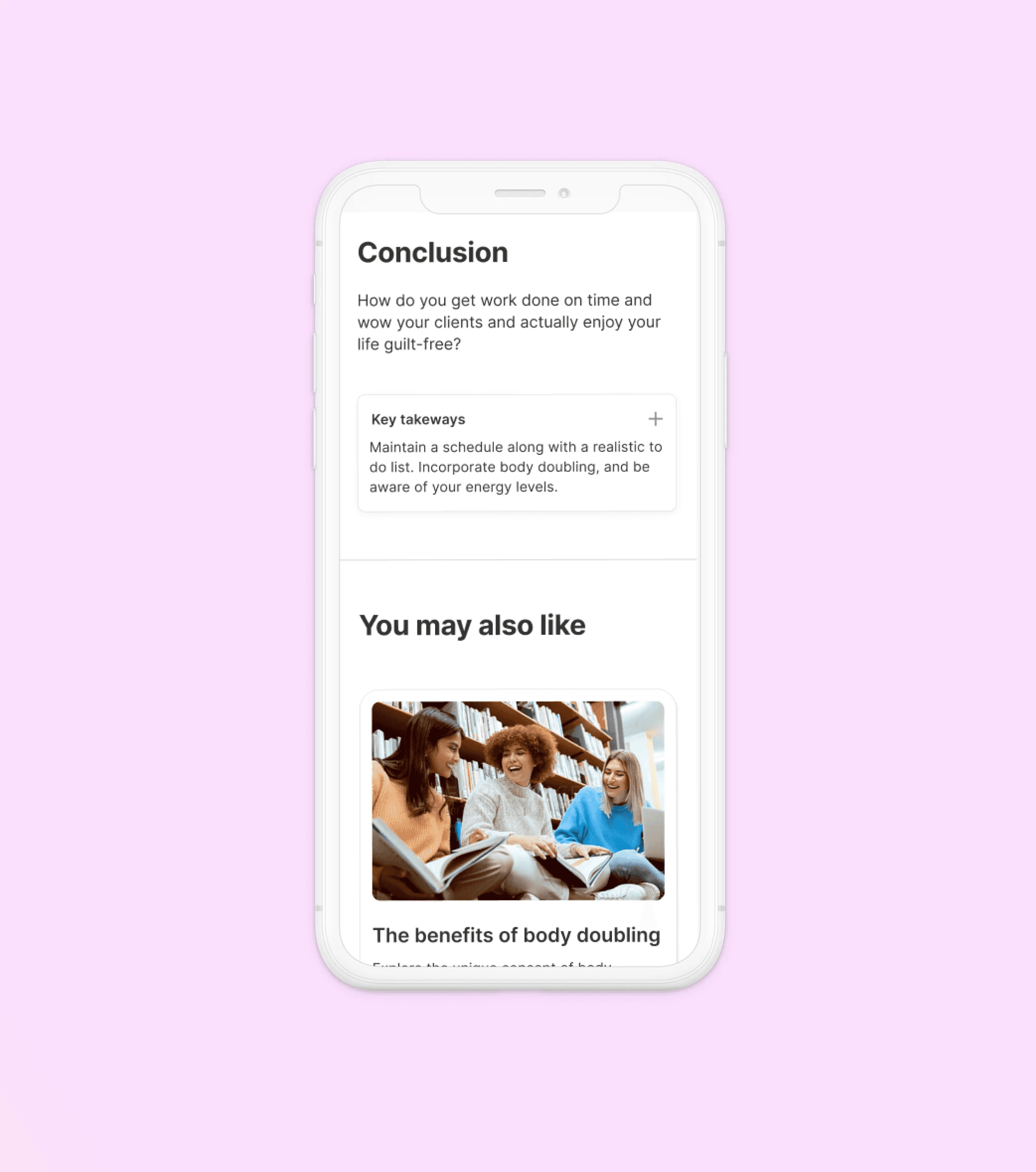
5. Use Consistent Layouts (Jakob’s Law)
Explanation: People prefer familiar designs that work the same way as other sites they use.
Application: I kept the layout consistent across all pages, making it easy for users to navigate without having to learn new layouts.
Consistent layouts across all pages
5. Innovative Design elements - TL:DR and Key takeaways
Explanation: In the user interviews, multiple users mentioned that they struggled to find the specific information they needed in the big wall of text. They also voiced that it would be better if they know they knew the tl;dr of each section, and then decide if they wanted to read the entire section or not.
Application: I included a "key takeaways" section which can be opened and closed as per convenience. This gives users an overview and main takeaways of each section.
Key takeaways section
Overall, this project required me to balance engagement and overstimulation, as too much visual or auditory input can be overwhelming for some users. I also learned a lot more about accessibility and the importance of user testing every design that I make. I grew as a designer and I have more empathy and understanding for diverse groups of people.
Client testimonial
"This was the third consecutive project I hired her for. Saumya has done an excellent job with the blog. She designed exactly what we envisioned, a clean and minimal blog that makes reading easy for people with ADHD / ADD. 10/10 highly recommend working with her. "
- Maciej Klepaczewski CEO, Founder of WorkMode
And that concludes the case study.
Let’s connect and discuss how we can transform your business.
Book a call
You can also connect on LinkedIn, Twitter, or via Email.