Onboarding Flow Design
UX Design
Product Design
UX/UI

Project Overview
Client: WorkMode, an ADHD-focused productivity startup
Industry: Healthcare & Wellness, Productivity
Timeline: 2 weeks
My Role: Lead Product Designer
Discover how I revamped WorkMode’s user onboarding to cut bounce rates and boost engagement drastically. Below, I outline the process from initial challenges to impactful solutions.
TL; WR- Too long, won't read?
Here’s a super short video explaining the solution 👇
Click here
The results I delivered
Decrease in Bounce-Off Rates: Improved by 30%
Increase in Engagement: 12% more users clicked on “Connect”
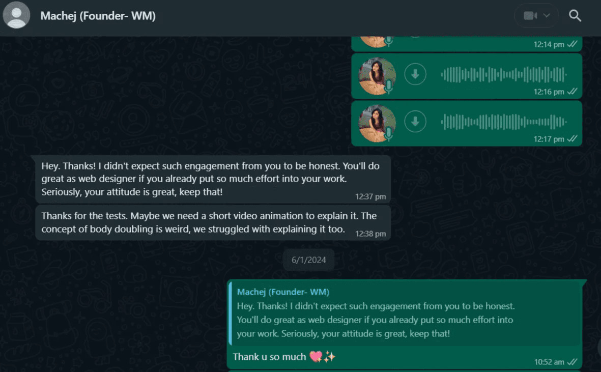
Client testimonial ⭐⭐⭐⭐⭐ CEO and Founder of WorkMode
About the project
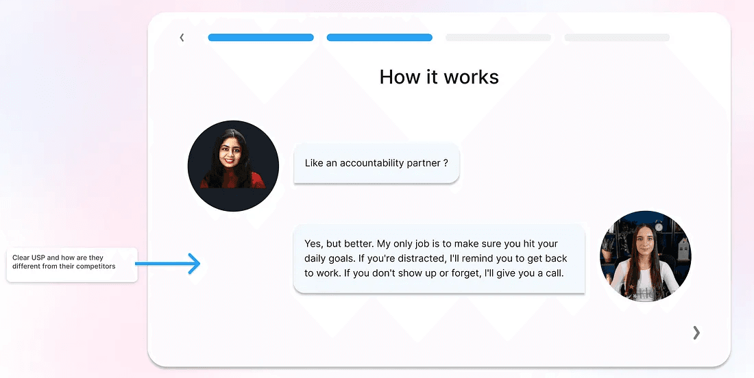
WorkMode provides focus as a service. You connect via video call and share your tasks, estimate the time needed, and dive into a focused work session. If you get distracted, they gently nudge you back to work. You can even share your screen for extra accountability, and they’ll also remind you to return after breaks.
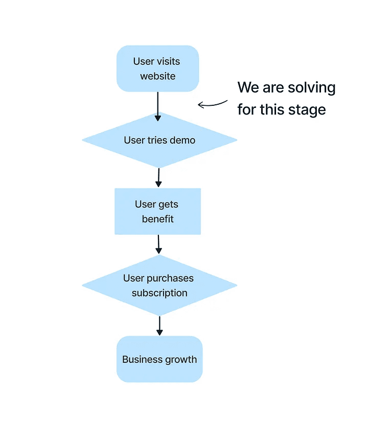
The founder approached me with a UX problem - "People coming on the website are not taking the demo session and are bouncing off the moment the call connects."
If users do not take the demo, they will not purchase subscriptions to this service, so the startup won’t be sustainable.
Gathering Insights
I brainstormed with the founder and a few senior designers the possible reasons why the users clicked off —
Did not understand the structure of the service
Were not interested in the service — (this was struck off as major traffic was coming from ads and Google search, so the users were interested in solving their procrastination)
Were not expecting a demo session where they would have to switch on their camera — thus quickly leave when the call connected.
Next, I validated these assumptions with representative users.
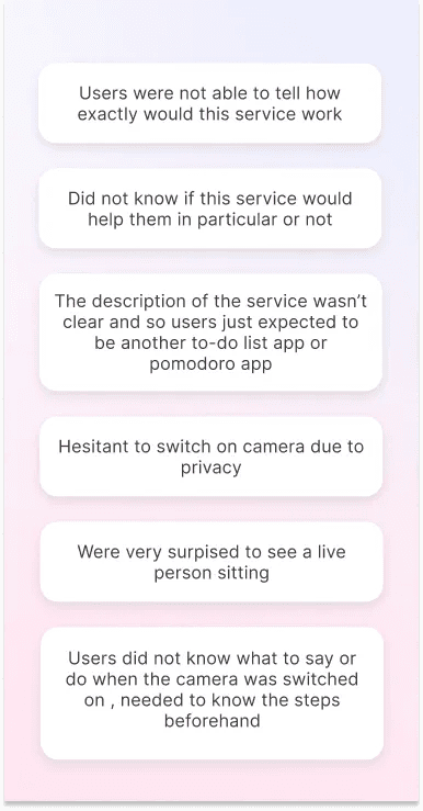
From the interviews, it was clear these were valid reasons.
The structure and working of the service were not obvious- it seemed just another to-do list tool or Pomodoro timer.
It was not clear that clicking on Connect would make them join a video call- users were genuinely surprised to see a live person sitting to watch them work.
What would the solution consist of?
This is what I ideated upon.
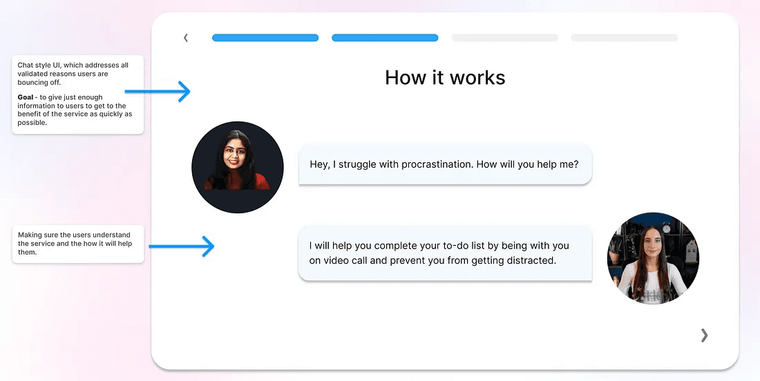
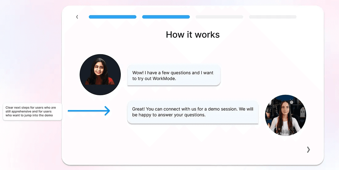
Quick onboarding — explaining the service.
The goal is to only give relevant information to make sure users get the benefit as quickly as possible.
(*WorkMode primarily solves for procrastinators, so the onboarding needed to be quick and broken down into multiple bite-sized pieces)Elements of delight to keep the users engaged and complete the onboarding.
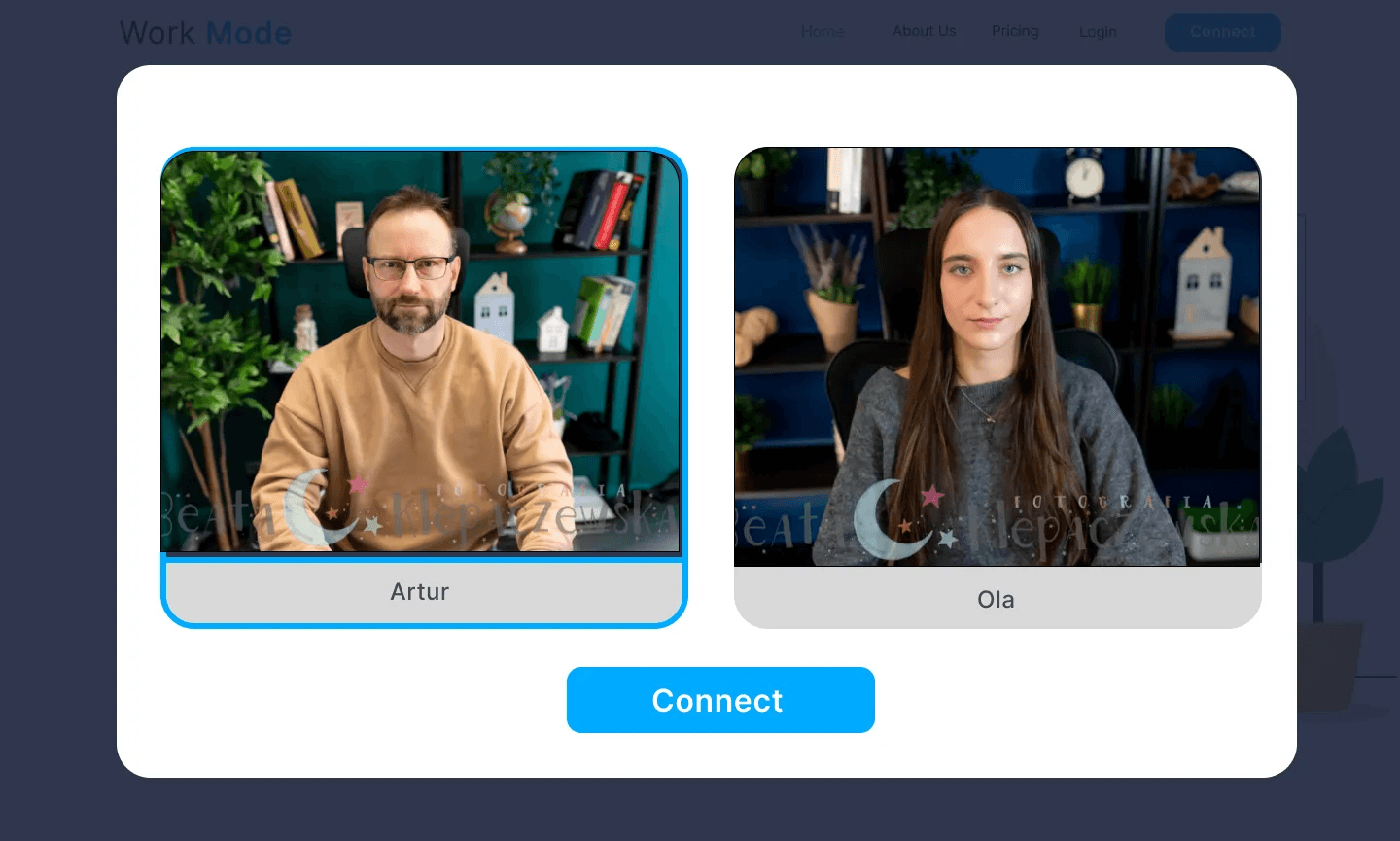
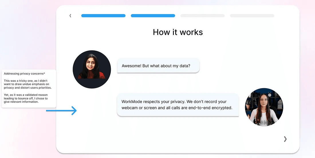
Addressing privacy concerns —
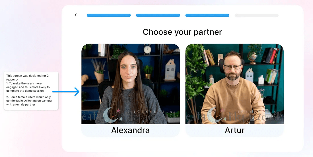
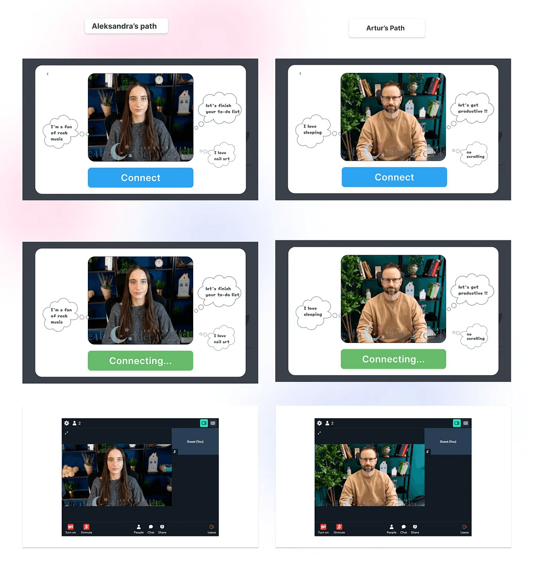
a. By having a “Choose your partner” screen — give users a choice to pick who they wanna work with. (*Some female users only prefer female partners)
b. Let the users know calls are end-to-end encrypted and there are no recordings or screenshots of the calls.
LoFi Design for ideation
With the solution validated, I threw myself into the pursuit of polishing my pixels and giving the visual design a glow-up.
The Final designs
The Results
The solution has been designed and received positive feedback from stakeholders and other designers.
Increase in people clicking on connect — 12%
Decrease in bounce-off rates- 30%
And I got another happy client :)
In hindsight, I see that each iteration enhanced not just the design, but me as well as it taught me truly valuable lessons. A few of them —
1. Feedback at every stage is the fastest way to get work done. It helps to speed up the process of discarding inefficient or incomplete solutions. Fail fast, design faster.
2. Design is not done in isolation.
You have to put yourself in the shoes of the users and constantly collaborate with stakeholders and other designers — even if it’s just for critique.3. Not getting too attached to the solutions was a big one. Iteration is a part of the process. It’s inevitable and essential.
Even though I have designed a robust solution and validated it with many users, if in future data speaks otherwise, I would happily jump into iterations.
And that concludes the case study.
Wow, you made it to the end.
Something tells me you and I should talk.
Let’s connect and discuss how we can transform your business.
Book a call
You can also connect on LinkedIn, Twitter, or via Email.